
Introducing the Brand - BLISS
Bliss is a Food Industry that encourages good feeding at substantial prices. They are focused on providing the best meals for the folks round town at very affordable prices. To put their market forward, they need a Brand that would speak for them even in their absence.
To achieve this, I took ample time to research on the various Eateries we have around us, noting their consistency, style, delivery and operations. This was to help me achieve the feeling of "Hunger and Trust" as that is what Bliss requires. The hunger for food by their customers and the trust in the services of Bliss.
Also, as the name of the brand implies, Bliss is a feeling of satisfaction and happiness, where one forgets everything else and lives in the moment. So considering this factor, I took ample time to come up with a Concept that would really stick and promote the image of Bliss.
So follow me as I unveil the brand "BLISS"
Oh, and by the way, this is an imaginary brand... lol

Now, I'm pretty sure you are wondering what the concept behind the brand is. Why don't i guide you through my thought process, execution and applications?

Considering that BLISS is a formal business with less constrictions on modalities, I went for something playful, yet visible. At the same time, complicated designs are rampant, so I decided to go for something simple. I mean, who doesn't love simplicity. It is easier to remember a simple logo than a complicated one.


The next question would be "Why choose these colours?"
Red, Orange and Yellow are known for their characteristics of evoking the feeling of hunger in people. That is why, according to my research, a lot of Fast Foods, Eateries, Take-Outs and the likes have the colours red, yellow and orange combined individually, in groups or in conjunction with neutral colours.
Also, the feeling of satisfaction is closely associated with Orange. I would have gone for that but a combination of red and yellow gives orange. Red evokes hunger more than the other two, so after trying out the several combos, I discovered that the best combination was actually red and yellow for what i plan to achieve. Black and White were chosen as my neutral colours for texts and other shapes.
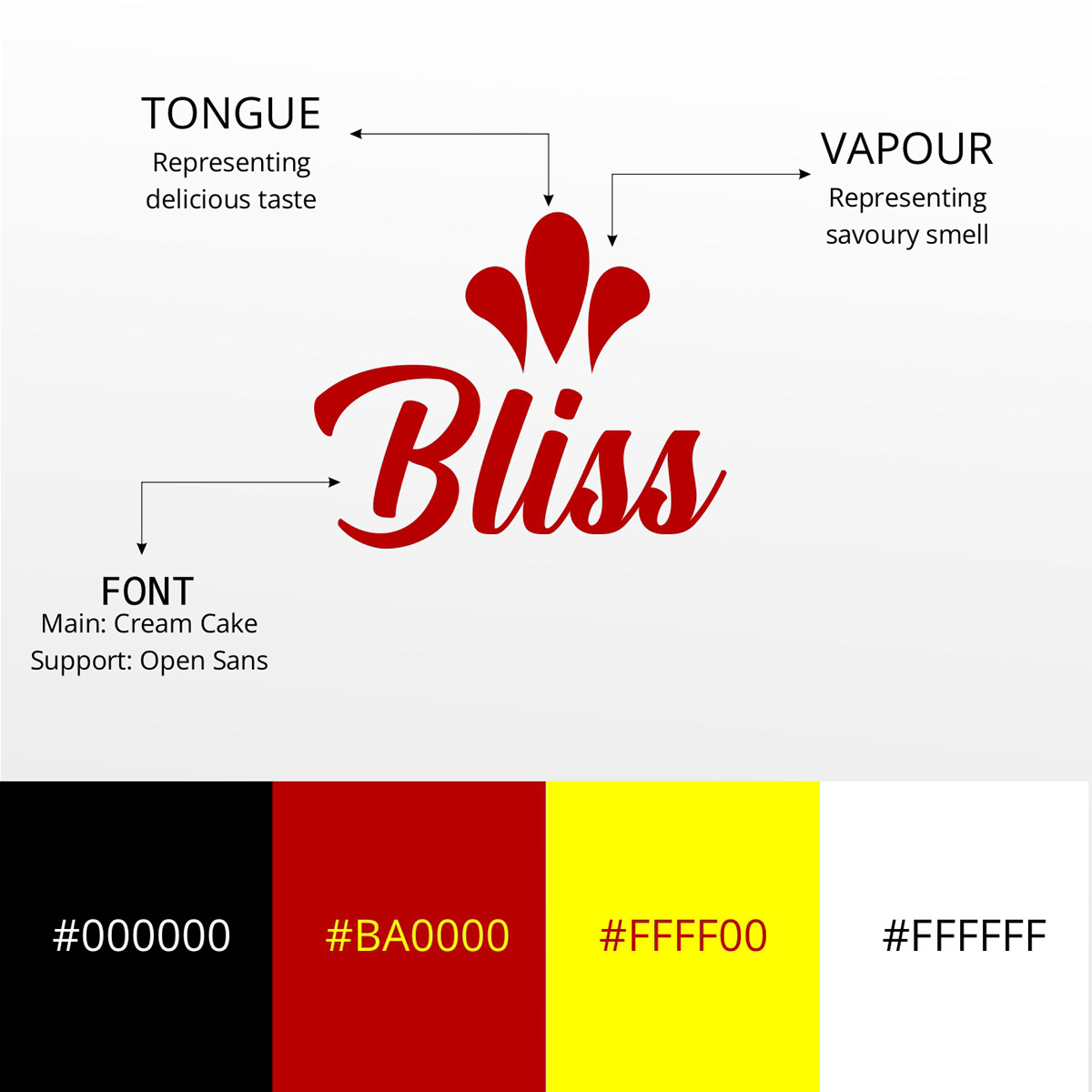
Now, we can see how the brand stands out and how my thought process worked. The two curved lob like shapes represent vapour/aroma and the one in the middle represents the tongue. They are facing upwards to evoke a arising need for satisfaction by customers. Kinda makes you want to hold 'em down, right?
The font used for the Brand Identity is called Cream Cake and the supporting font for texts is Open Sans.
Also, the colour codes used for BLISS are displayed. By now, I'm sure you are beginning to agree with me on a lot of things.
So, how do we apply the Brand to real life situations?

Let's see how the Brand works...

Quite salivating, ain't it?
So, let's say Bliss is planning an expansion and needs to collaborate with other bodies to get this done. The Manager would need some sort of identification that speaks for the Brand when he is meeting with his Partners. So, let's see how the tag Business card looks like.

I like it... What about you?
For the staff who'd be dishing out the meal at the Counter, I've got a little something for them.


A combination of these two with black trousers and sneakers would look dope, right?
And for the final touch, we have branded cups for BLISS. It makes sense if they can brew coffee or juice for their customers while they are having a steak, chicken or salad. It would definitely leave an impression.

And yes, it's a wrap!
Let me know your thoughts in the comment section and follow me for more because I'm cooking.


